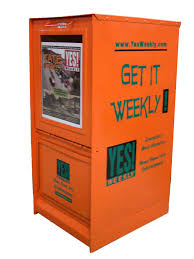
 This week's edition of the YES! Weekly is summed up in one word...sharp. A redesign of the area's alternative weekly shows many surprises.
 Editor-in-chief Brian Clarey:
I agree.
The new YES! Weekly is sleek, clean and more sophisticated in its appearance than we ever thought it could be.
I think it looks like Rolling Stone, before it got tiny.
Big props go out to the new design team — Art Director Lindsay Emeigh, Ashleigh Waters and Loren Bailey — who logged some pretty serious hours on this project.
And kudos to Publisher Charles Womack, who was bold enough to drive this redesign through and see it home.
Don't worry — YES! Weekly still has the same great content from the same great writers, but we look a whole lot prettier.
E.C. :)


1 comment:
The fonts are too small for an old guy like me to see. Maybe that was the purpose.
Post a Comment